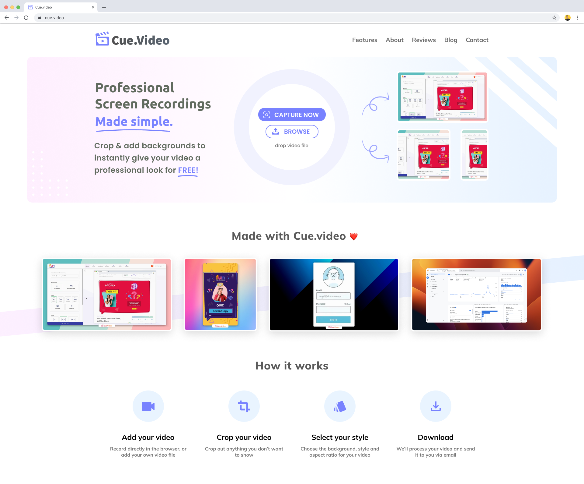
Cue.Video - New homepage design
Survey Results
Does it look professional and trustworthy?
Is it clear what the product does?
Any other thoughts or comments?
5 answersReviews (5)
Does it look professional and trustworthy?
Is it clear what the product does?
Any other thoughts or comments?
The new design is much nicer than the current one, great job! It looks much more professional.1- I feel like a Google Chrome extension might be interesting for some people.
2- This is a tough market, there are so many tools out there for making screenshots, screen recordings... Yours need to standout and from what I see, the main differentiating factor is the fact that you add those nice backgrounds. Is it enough to make this a widely used product? I don't think so.
3- The watermark is great for YOU because it allows you to get visibility whenever someone posts a recording that used your tool. But I would not use it just because of that. So you're loosing users too because a lot of people don't want watermarks. You would have to try both ways and find wether the watermark helps your growth or not. Without the watermark people will have to ask the person that made the recording how they did it and then they'll refer them to your tool so much more effort... So it's unclear which way is best for driving growth, but personally, just because there's a watermark, I wouldn't use it and won't pay just to have the watermark removed.
Does it look professional and trustworthy?
Is it clear what the product does?
Any other thoughts or comments?
There's way too much going on in the hero section. No idea what I should be focusing on to get your point across.There's way too much going on in the hero section. No idea what I should be focusing on to get your point across.
Does it look professional and trustworthy?
Is it clear what the product does?
Any other thoughts or comments?
Why not OBS? Or Loom? Or Nvidia screen record? Maybe I don't get it because I'm on mobile?Is this intended for mobile? New front page obviously isn't but there's not much to do on the current one either.
Took a second look using desktop view. There's a blog link that isn't clickable. There's just not much content. I read everything in less than a minute.
Does it look professional and trustworthy?
Is it clear what the product does?
Any other thoughts or comments?
How it work should have arrow button from left to right.How could this differentiate with current product?
Does it look professional and trustworthy?
Is it clear what the product does?
Any other thoughts or comments?
The demo video is great. It should be the primary focus on the hero section. I would add a try for free button that links to your upload section on your website.The demo video is great. It should be the primary focus on the hero section. I would add a try for free button that links to your upload section on your website.
